Spud & Butter
Comfort Food Wasn't the Challenge. Differentiation Was.
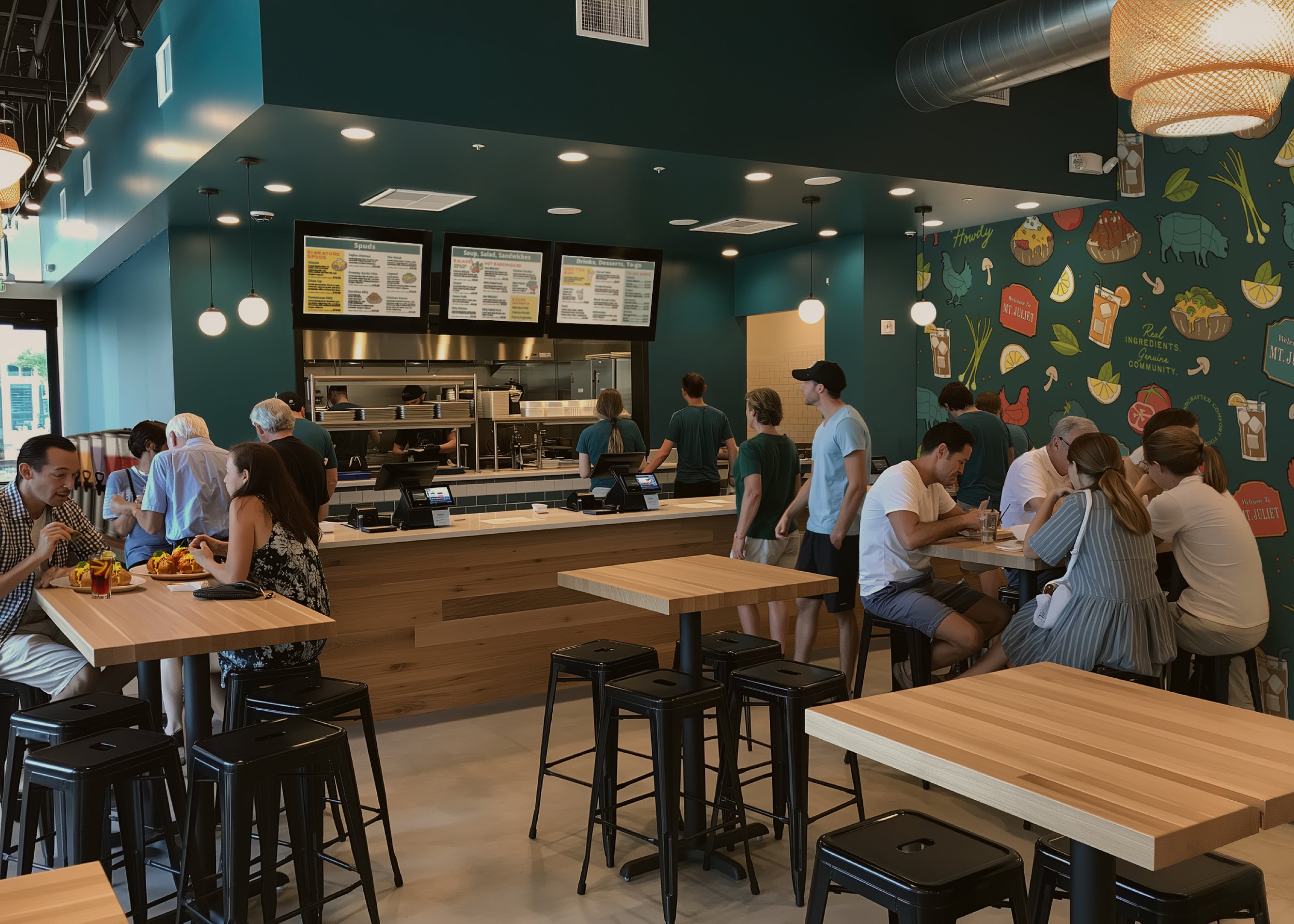
When the family behind Spud & Butter came to me, they weren't simply opening another restaurant. After more than fifty years in the hospitality industry, they were creating an entirely new concept rooted in everything guests had loved about their previous restaurant, while adapting it for the way people eat today. The vision was fresh, fast-casual comfort food made with real ingredients, genuine hospitality, and modern convenience. The challenge wasn't creating another trendy Southern restaurant. It was creating a brand that felt familiar without feeling dated, elevated without feeling pretentious, and memorable enough to stand apart in an increasingly crowded metro-Nashville restaurant market.
During our discovery workshop, we unpacked the business from every angle, defining the long-term vision, business goals, customer personas, market positioning, brand personality, mission, values, and competitive landscape. We also looked beyond opening day, discussing future catering services, bottled tea products, additional locations, and how the brand could eventually expand throughout Middle Tennessee. Every creative decision that followed would be built to support those ambitions rather than simply creating something visually appealing.
As we researched competitors throughout the region, a clear opportunity emerged. Most comfort food restaurants leaned heavily into nostalgia, but many felt outdated, overly traditional, or lacked personality altogether. On the opposite end of the spectrum, national fast-casual chains delivered convenience but often felt cold, transactional, and impersonal. Spud & Butter had an opportunity to bridge those two worlds by delivering fresh, handcrafted comfort food with the speed people expect today, while never sacrificing warmth or hospitality. That positioning became the foundation for the entire visual identity.
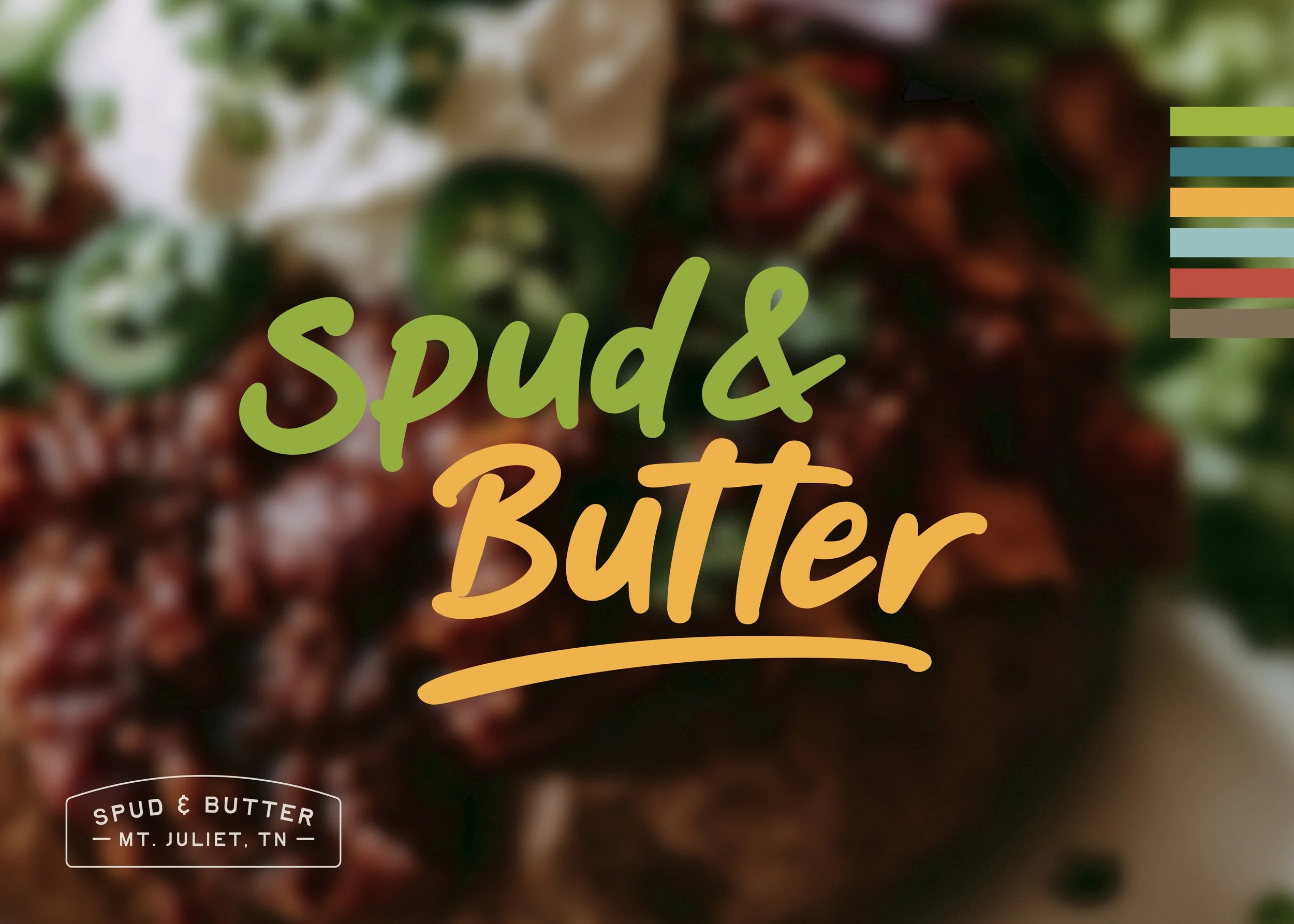
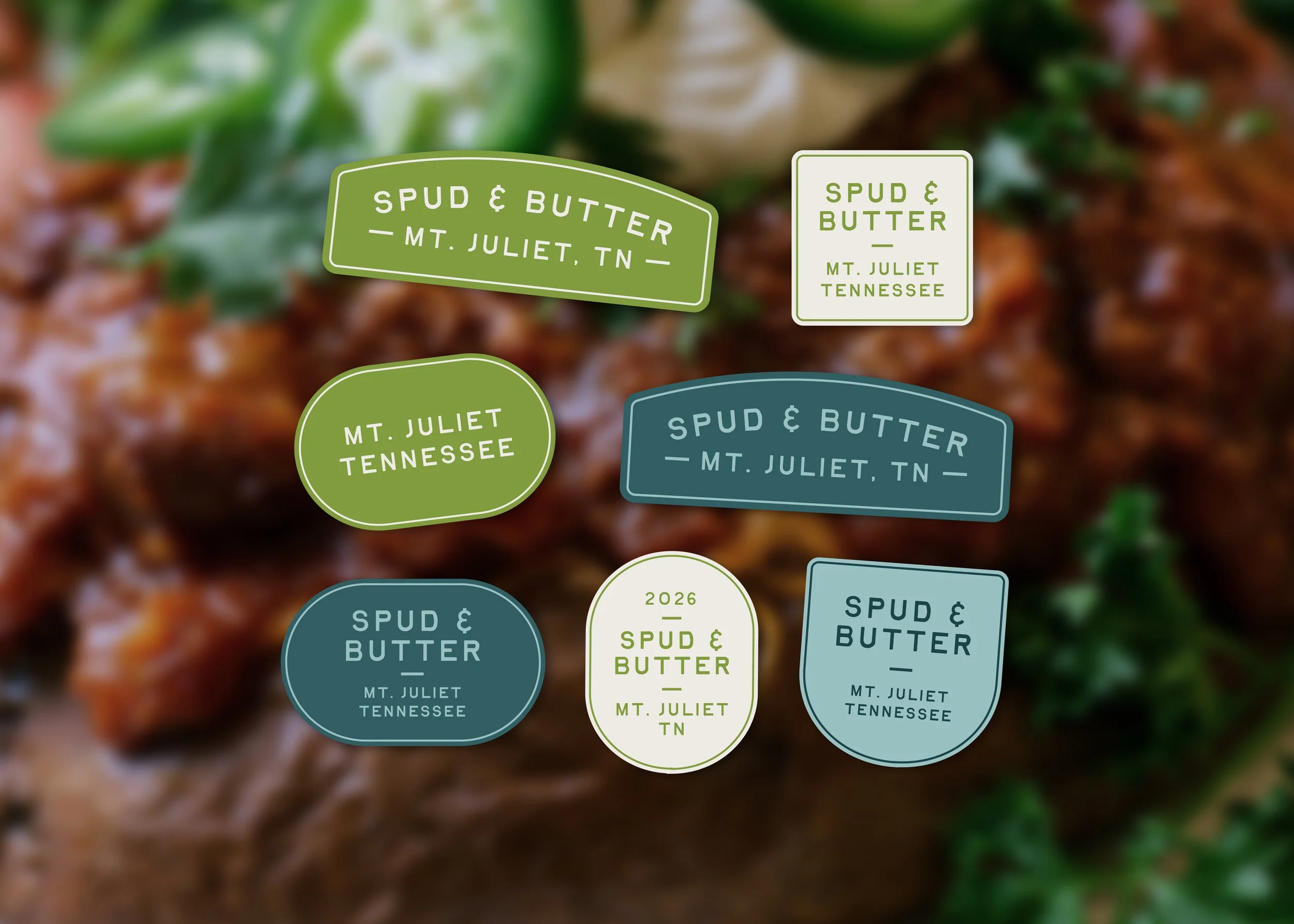
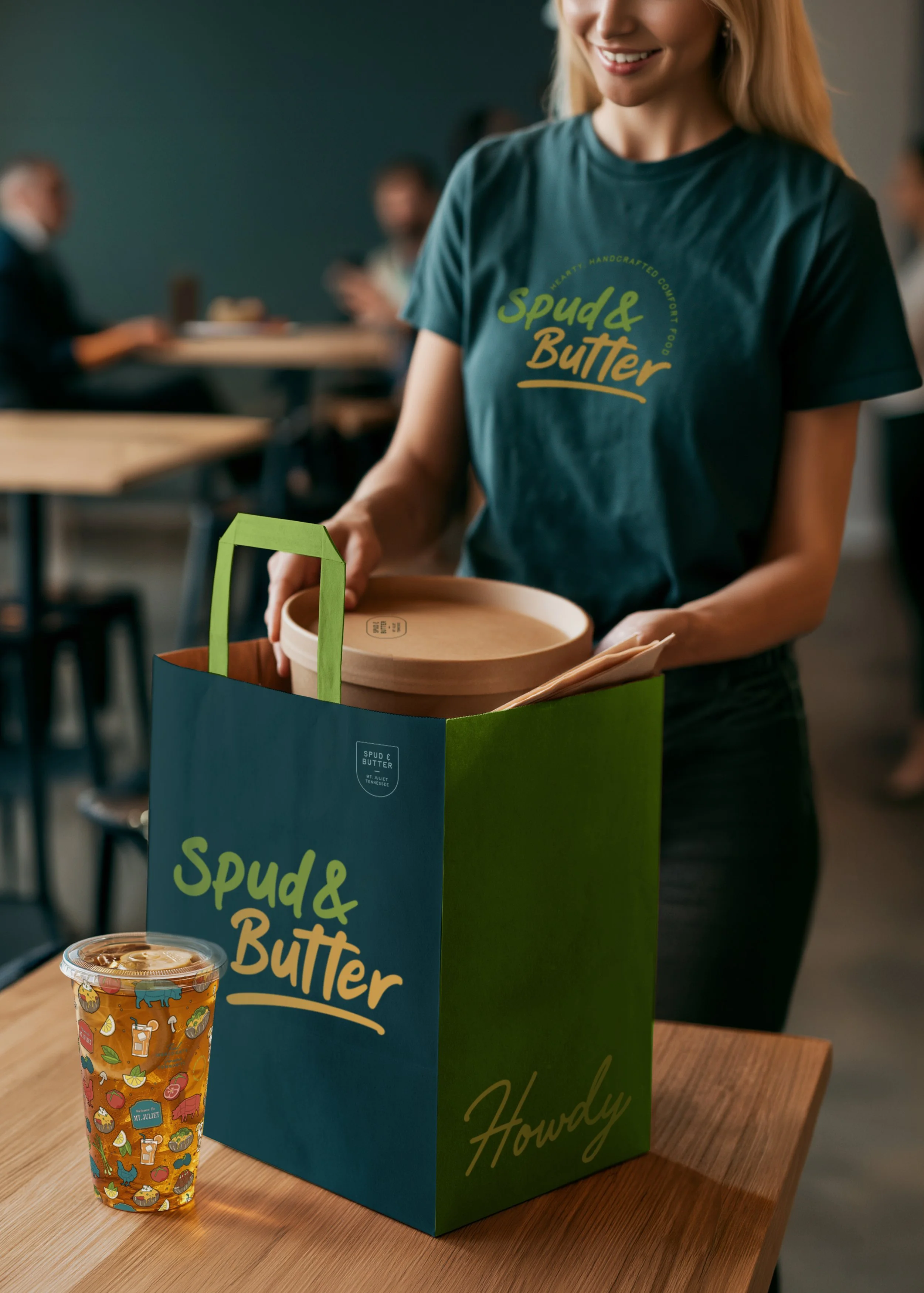
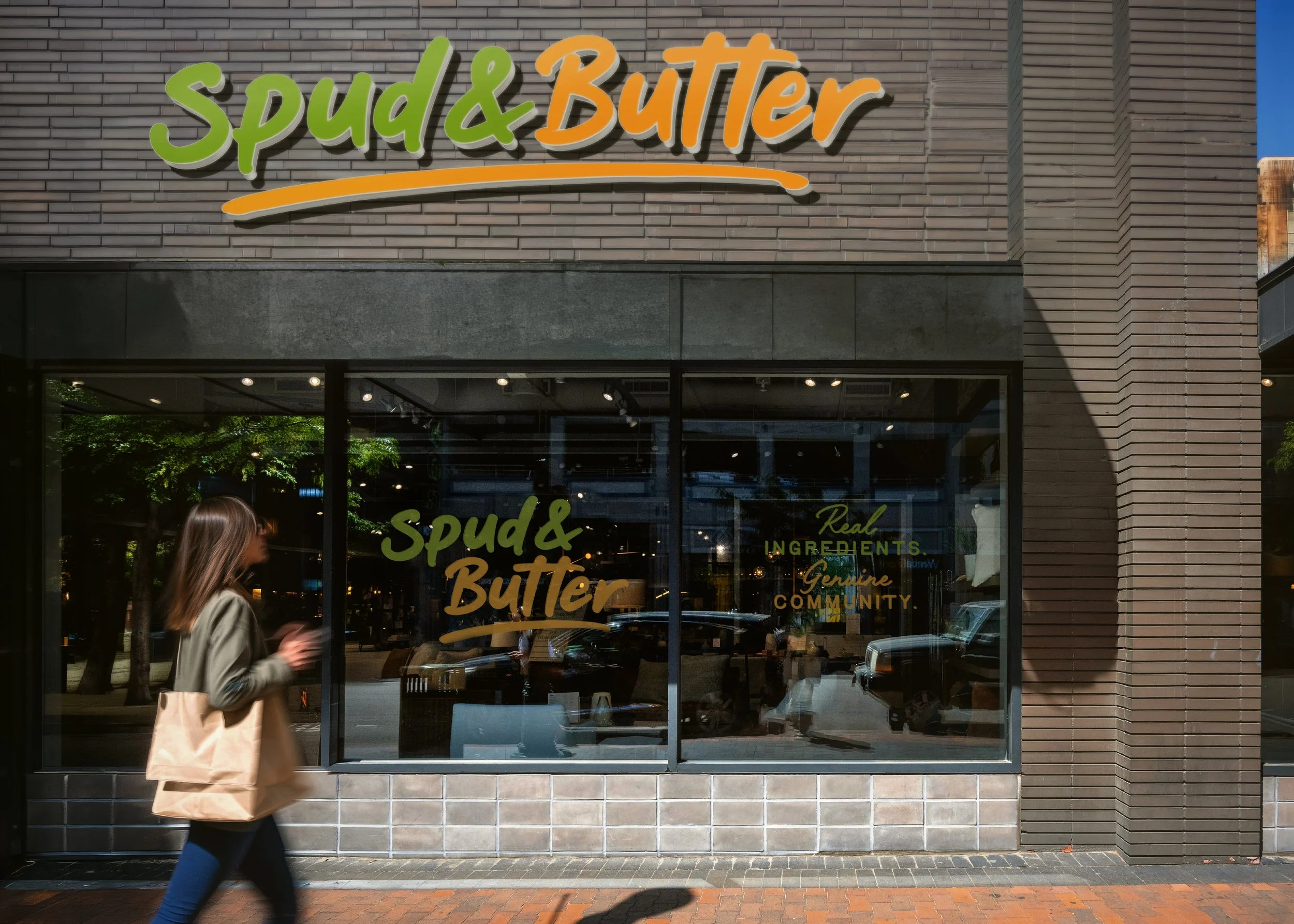
Once the strategic direction was established and defined in detail, every visual decision became intentional. Rather than designing a polished corporate mark, I created a hand-lettered logo that immediately communicates warmth, personality, and approachability. The organic lettering feels handcrafted, mirroring the made-from-scratch food and genuine hospitality guests experience inside the restaurant. The subtle underline grounds the logo while adding movement and energy, creating a mark that feels welcoming whether it's displayed on storefront signage, takeout bags, menus, or future product packaging. From there, I developed a complete logo suite that gives the brand flexibility across virtually every customer touchpoint while maintaining strong recognition.
The color palette was equally strategic. Instead of relying on the deep reds and dark browns commonly found throughout barbecue and Southern restaurant branding, I introduced bright greens inspired by herbs and produce to reinforce the quality of the fresh ingredients. Butter-gold naturally became the signature accent color, instantly connecting back to the restaurant's namesake while adding warmth, optimism, and appetite appeal. Rich teals added sophistication and trust, while earthy neutrals referenced potatoes, wood, smoke, and handcrafted cooking. Together, the palette feels nostalgic enough to evoke comfort while remaining modern, vibrant, and distinctly different from competitors.
Typography played an important supporting role in creating that balance between personality and functionality. Our chosen san serif provides excellent readability across menus, digital ordering platforms, and marketing materials, while a versatile serif introduces an elevated sense of hospitality that feels timeless rather than trendy. Handwritten accent typography was used sparingly to inject moments of personality without overwhelming the brand system. The result is a visual language that feels approachable, polished, and scalable across every touchpoint.
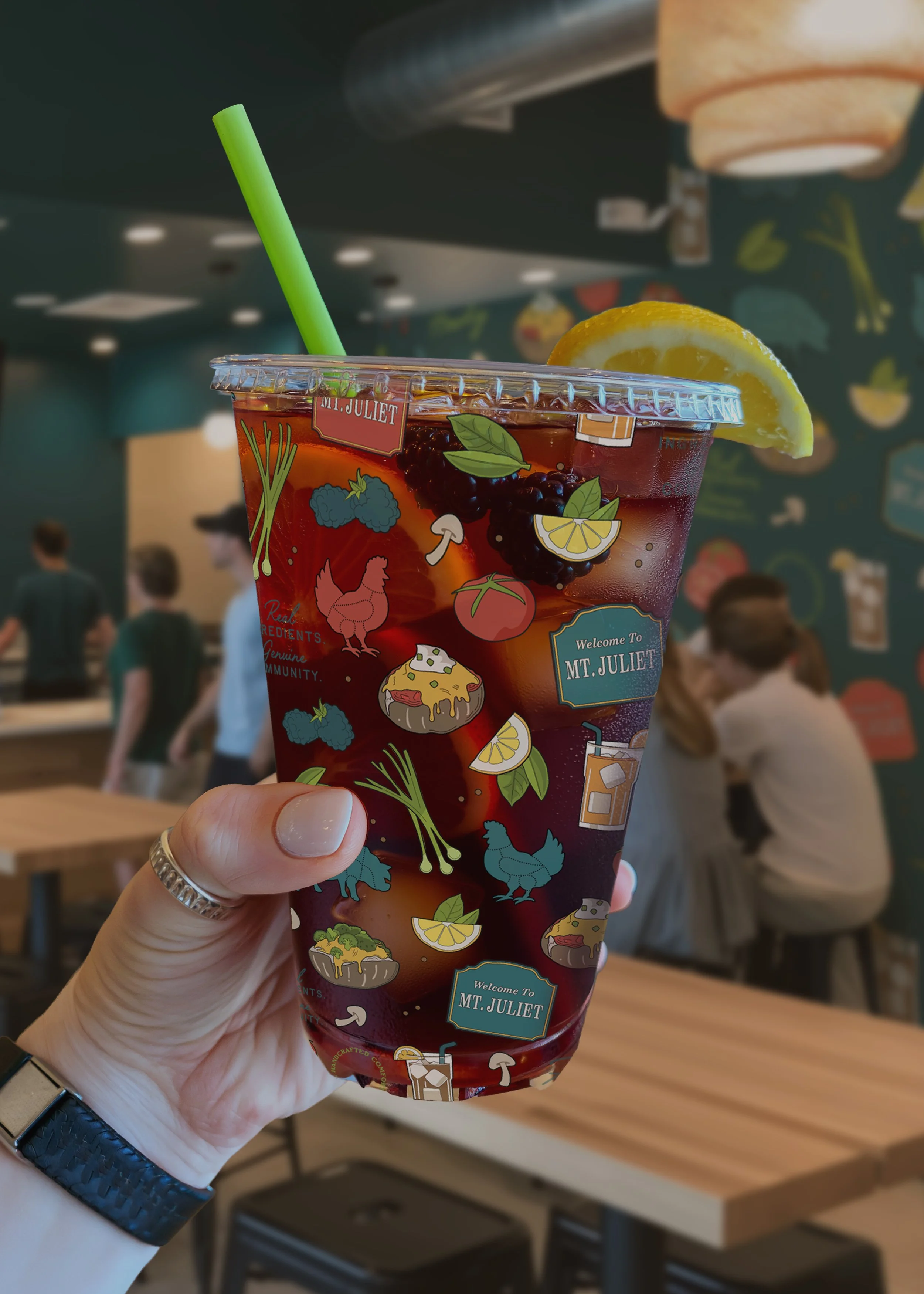
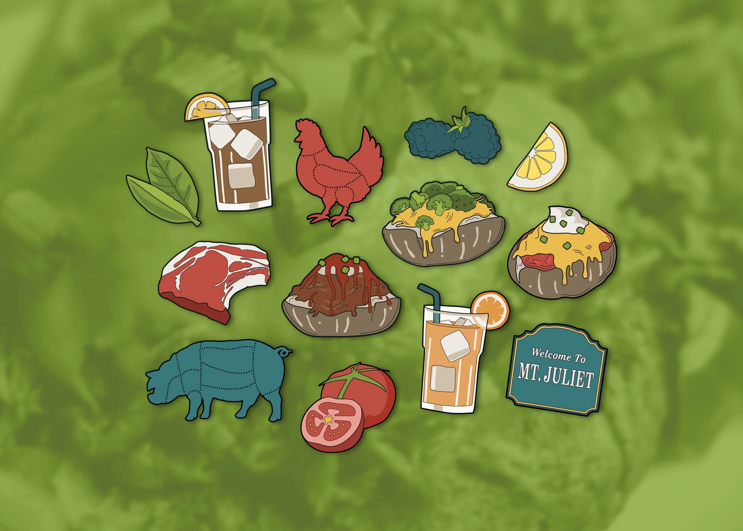
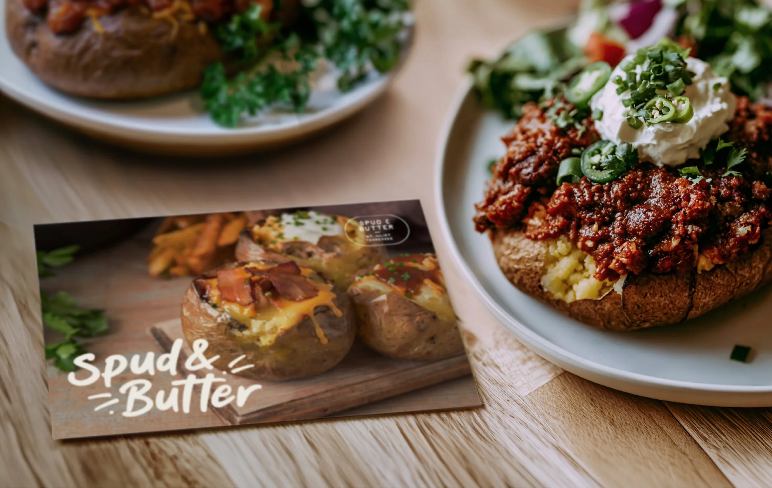
Beyond the logo and visual identity, I developed a complete brand system that included an extensive logo suite, icons, supporting graphic elements, typography guidelines, color systems, and photography direction. Every asset was designed with consistency in mind, ensuring the brand could seamlessly extend across storefront signage, uniforms, menus, catering materials, social media, merchandise, takeout packaging, and future retail products while maintaining a recognizable identity.
The final brand captures exactly what Spud & Butter set out to become: a place where comfort food feels fresh again. It reflects decades of hospitality experience while introducing a modern perspective that appeals to today's diners. More importantly, it provides a strategic foundation the business can continue building on for years to come. Rather than designing a logo for a single restaurant, we created a scalable brand built to support future locations, new offerings, and long-term growth without ever losing sight of what makes Spud & Butter special.