Much Love Creamery
When the founders of Much Love Creamery came to Jenn Cordova Design, they had little more than a family recipe, a dream, and a name. There was no existing branding, visual identity, packaging, or customer-facing experience. With a launch date quickly approaching, we had just 45 days to transform an idea into a fully realized brand capable of competing in a crowded category.
The challenge wasn't simply creating a logo. We needed to build an entire brand ecosystem that could attract families, tourists, catering clients, restaurant partners, and future retail customers while feeling authentic, memorable, and timeless.
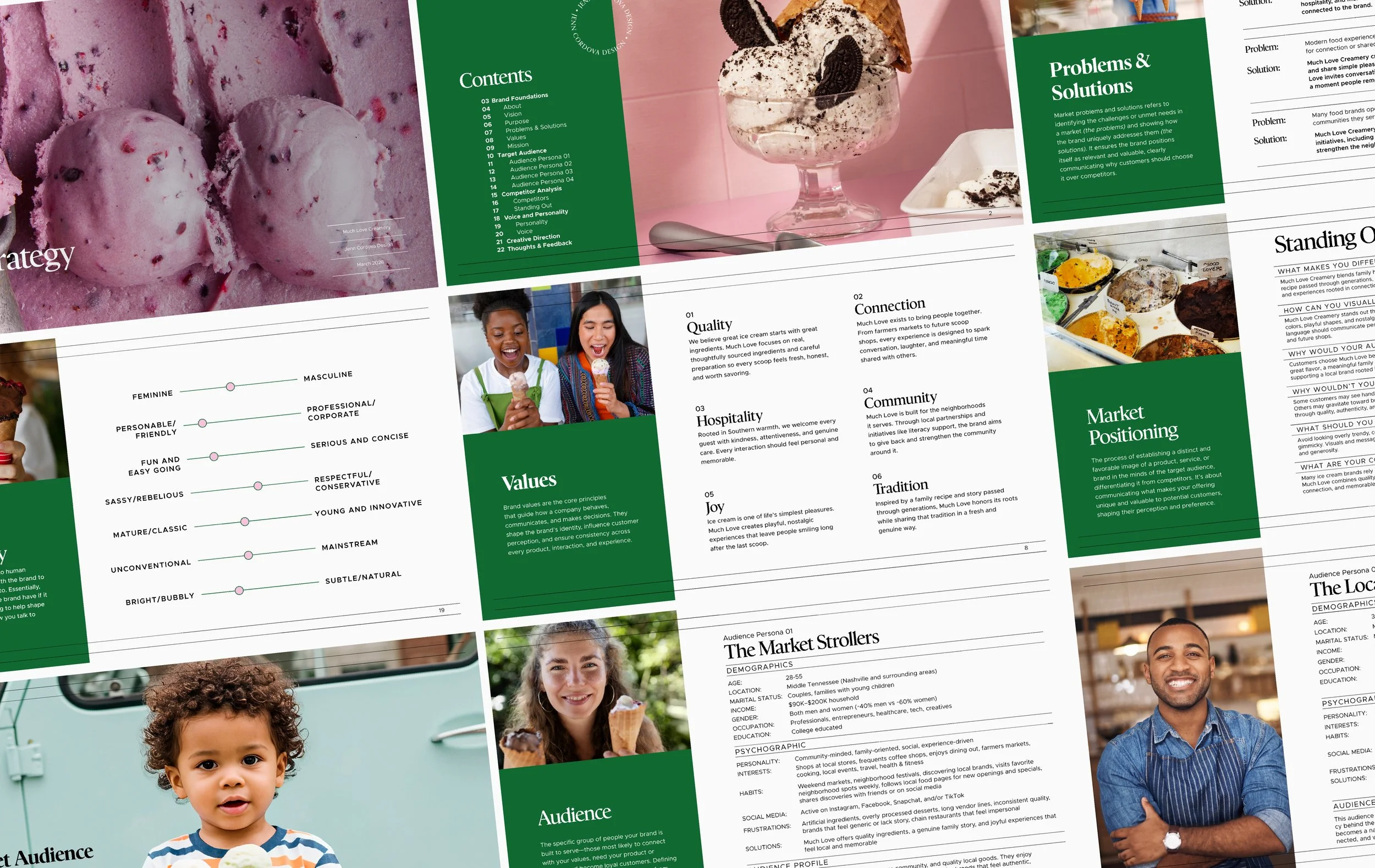
As with every successful branding project, we began with strategy. During our in-depth strategy session, we explored the founders' vision, goals, audience, competitors, values, positioning, personality, and messaging. What emerged was a brand rooted in connection. The founders envisioned a company that would bring people together, create meaningful memories, and become a cherished part of the community.
At the center of that story was a family recipe passed down from the founders' great-grandmother and carried forward through generations. More than an ingredient list, it represented family traditions, shared experiences, and the belief that some of life's best moments happen around food. That story became the emotional foundation for everything we built.
The strategy process also revealed a surprisingly broad audience. While families would become the primary customer, the brand also needed to resonate with Nashville tourists, catering clients, and restaurant partners. This required an identity that felt playful enough for children while remaining elevated enough to appeal to adults and future business opportunities. We also carefully evaluated the competitive landscape to identify opportunities existing brands were overlooking and create stronger emotional connections with customers.
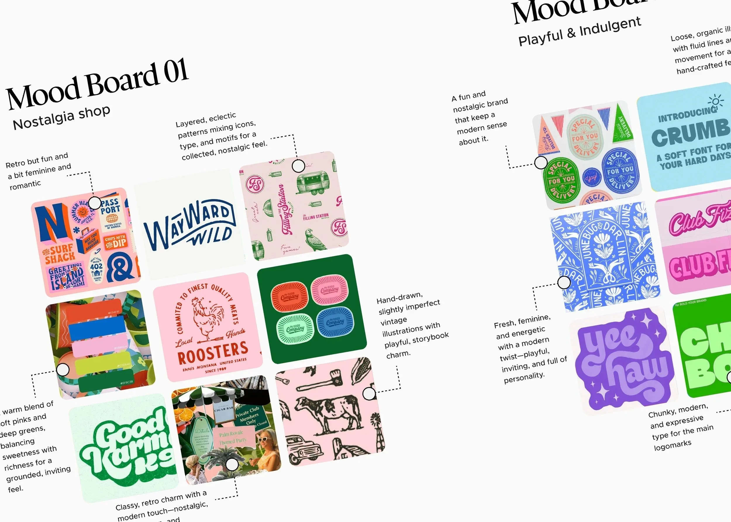
With a clear strategic direction established, we developed two distinct moodboards. While both aligned with the strategy, one leaned modern and playful while the other embraced nostalgia, tradition, and timeless charm. The decision became surprisingly clear during the presentation. Every stakeholder gravitated toward the same direction because it felt most aligned with the company they envisioned building.
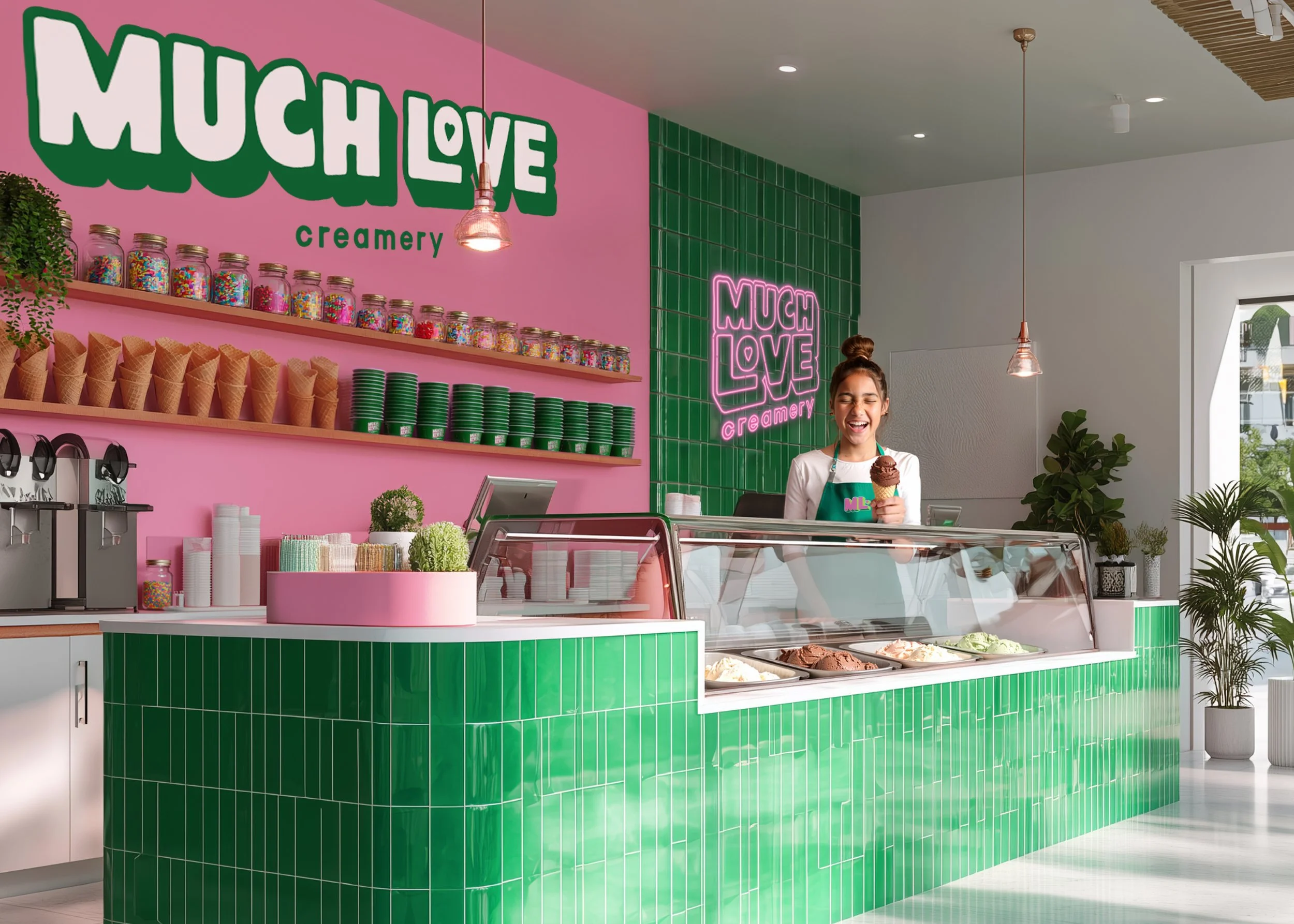
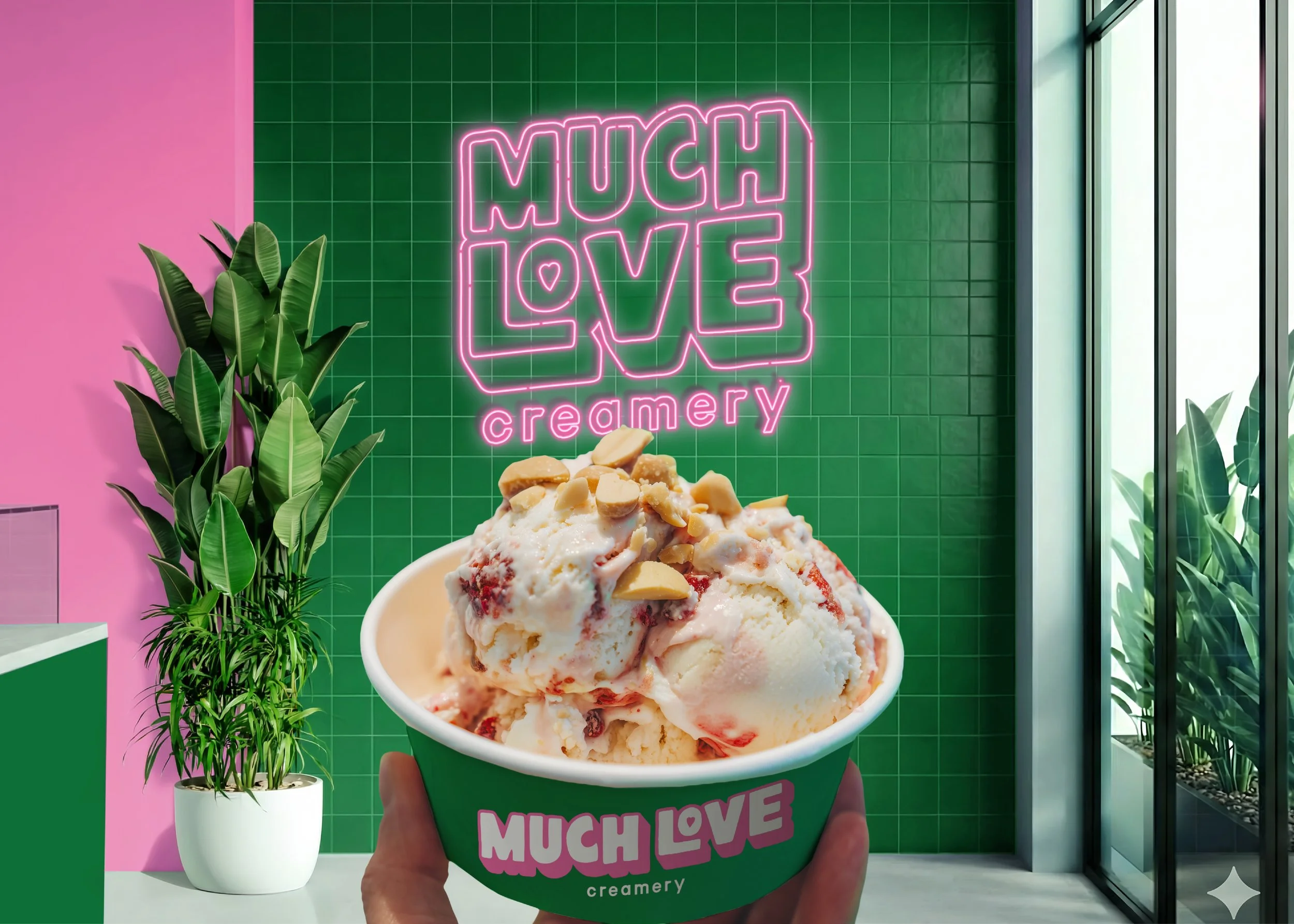
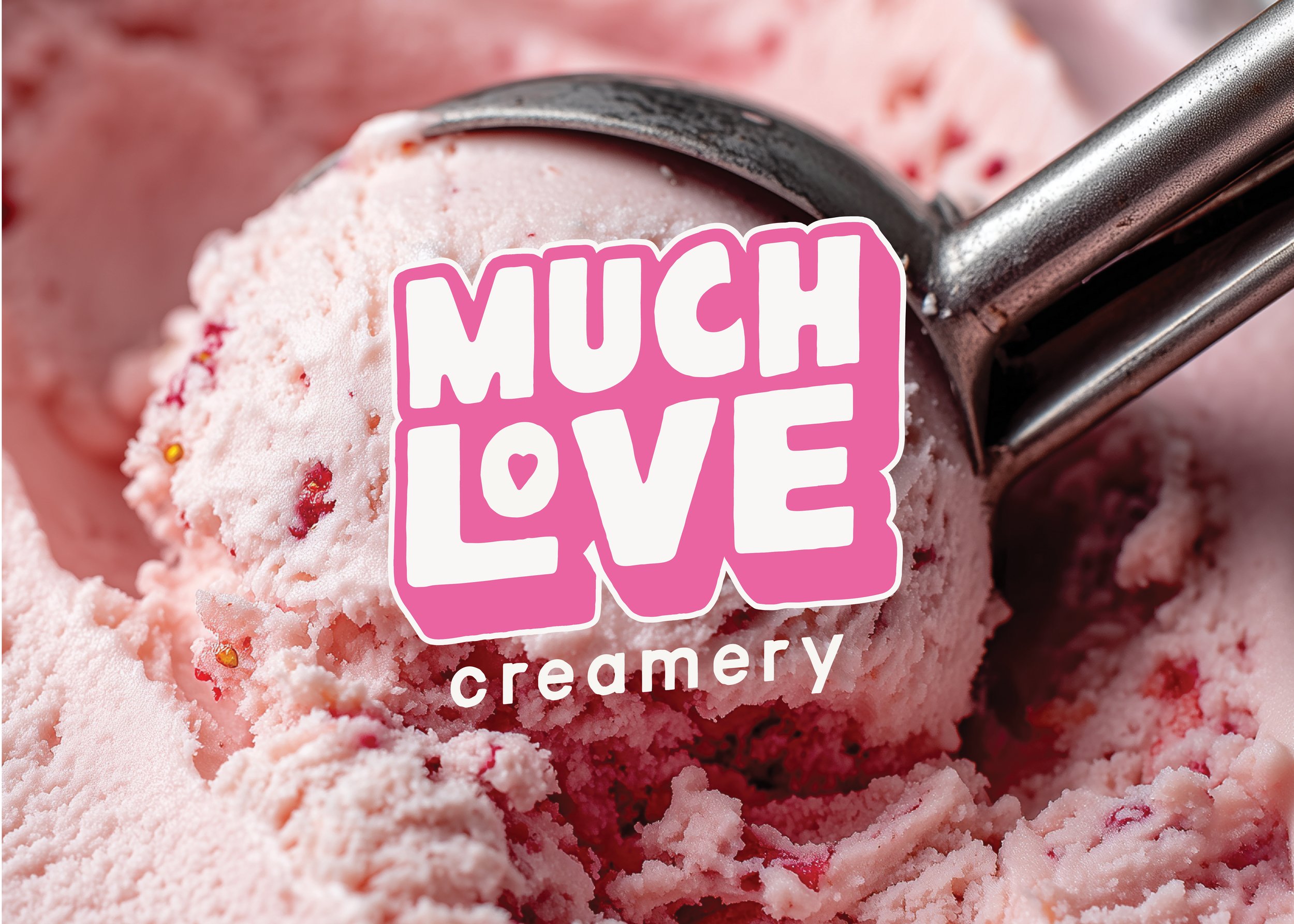
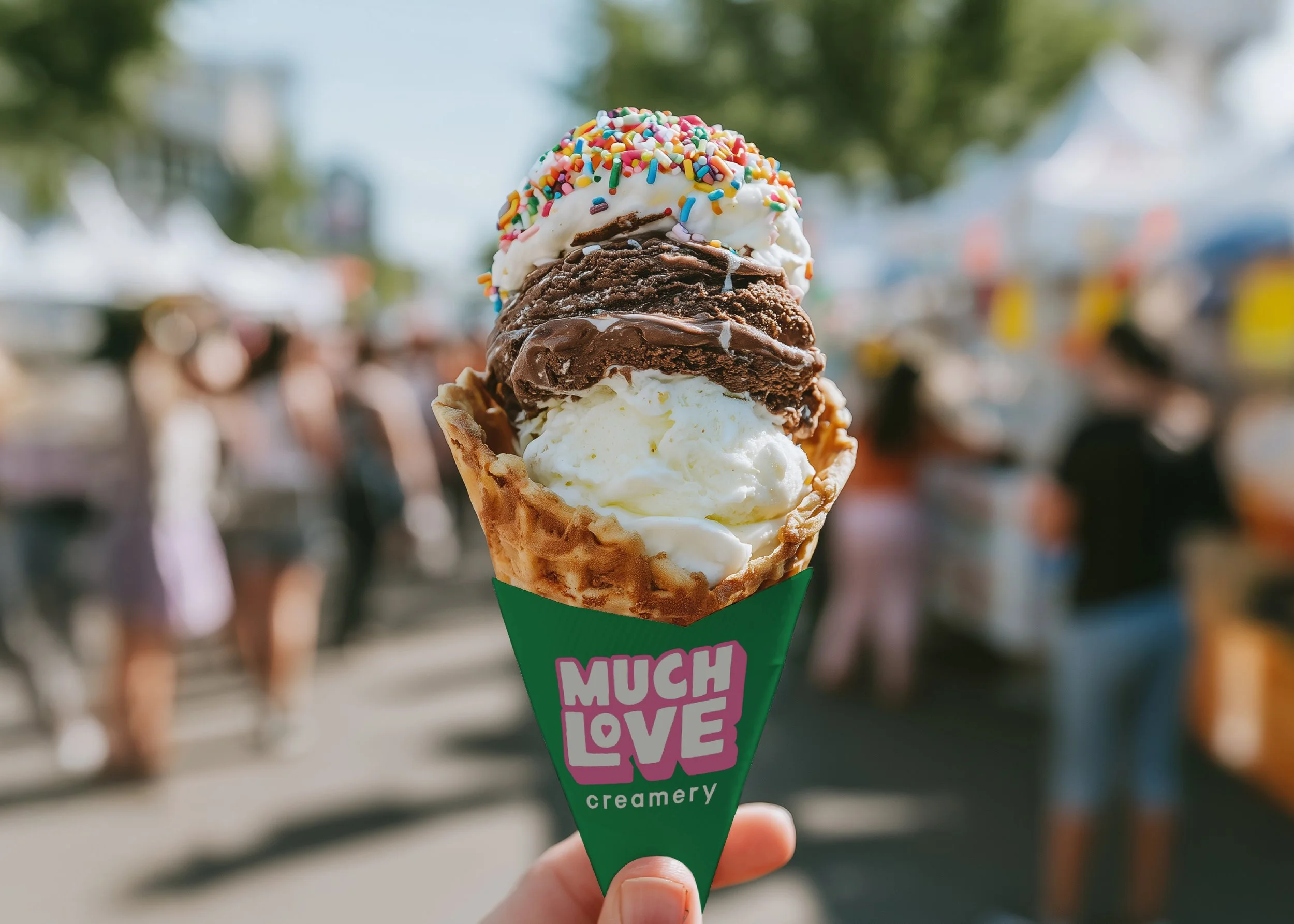
From there, we began building the visual identity system. The selected color palette combines bubblegum pinks with rich emerald greens to create a brand that feels both joyful and grounded. The pink introduces warmth, sweetness, and approachability, while the green reinforces quality, craftsmanship, and longevity. Together, they create a distinctive presence within the category and help Much Love Creamery stand apart from competitors relying on predictable ice cream aesthetics.
The palette was selected with the future physical experience in mind as well. Whether applied to packaging, merchandise, storefront signage, or interior environments, the colors work together to create a memorable destination customers will want to revisit, photograph, and share.
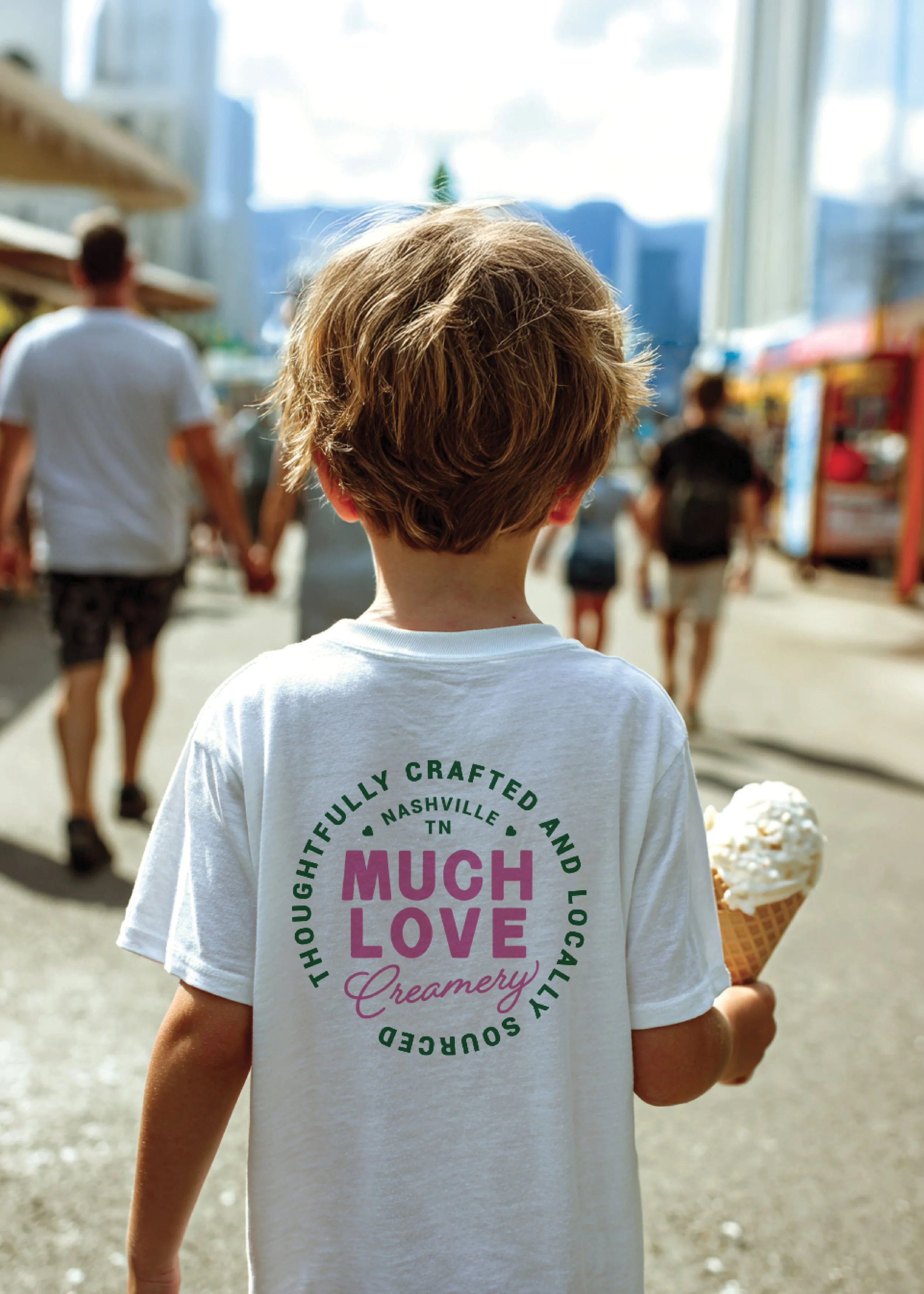
Typography played an equally important role. Inspired by classic ice cream parlors and neighborhood gathering places, the primary wordmark balances nostalgia with a modern sensibility. The typography was intentionally selected to feel welcoming without becoming childish and refined without feeling exclusive, allowing the brand to appeal to both families and adults.
The primary logo became the centerpiece of the identity system. Designed with storefront signage in mind, the mark features bold proportions, a highly recognizable silhouette, and enough visual weight to command attention from a distance. The oversized letterforms feel playful and familiar while avoiding the overly vintage aesthetic that can quickly feel dated. Hidden details, including the heart integrated into the wordmark, reinforce the brand's core message while creating additional memorability.
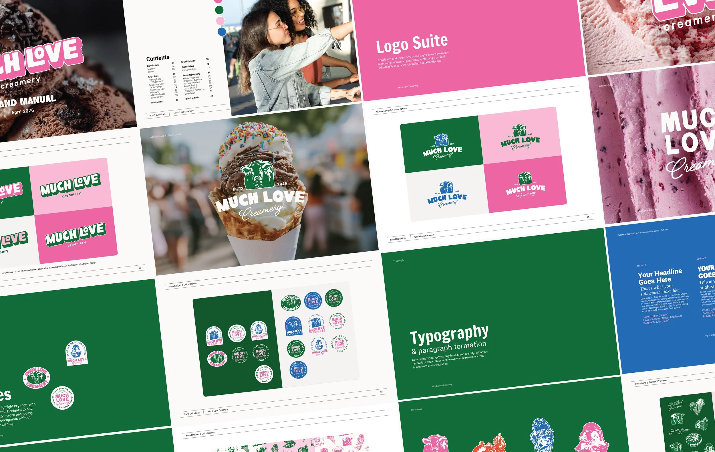
Supporting the primary logo is a collection of alternate marks, badges, and submarks that provide flexibility across packaging, merchandise, social media, catering materials, and future retail applications. Together, these assets ensure the brand remains consistent and recognizable no matter where customers encounter it.
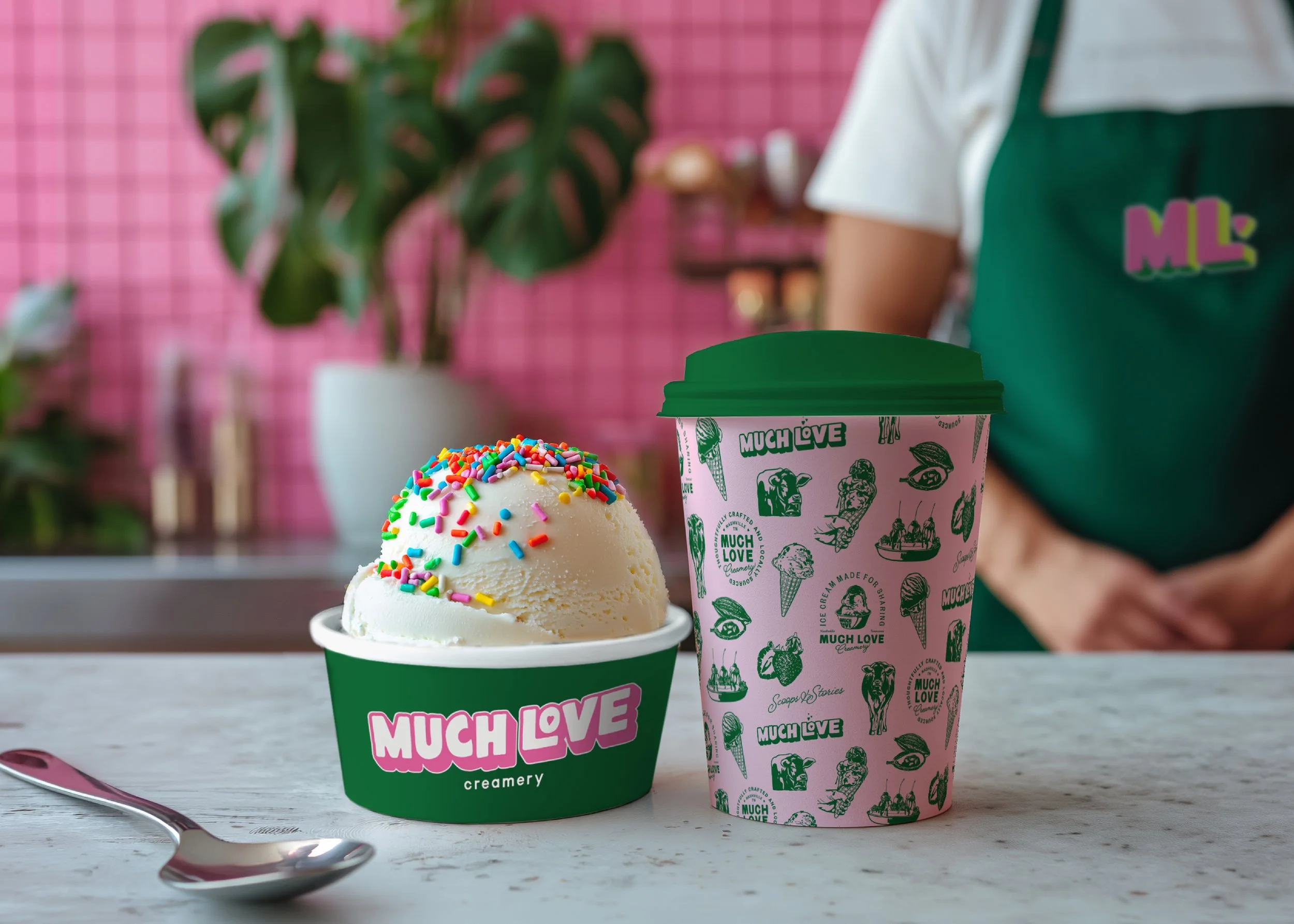
To further strengthen the brand's personality, we developed a custom illustration system inspired by family, local sourcing, tradition, and community. Drawing from the story of the family recipe and the values uncovered during strategy, these illustrations create a visual storytelling layer that extends far beyond the logo itself. Rather than simply decorating the brand, they help communicate its history, personality, and sense of hospitality.
These illustrations became the foundation for a custom brand pattern that can be applied across cups, merchandise, environmental graphics, packaging, and marketing materials. As the company grows, this pattern becomes a powerful brand asset that builds recognition while creating consistency across every customer touchpoint.
The result is far more than a visual identity. Much Love Creamery now possesses a complete brand system designed to support growth at every stage of the business. Whether expanding into multiple locations, launching catering experiences, partnering with restaurants, or introducing retail products, the company has a strategic and visual foundation built to scale.
Most importantly, the brand is rooted in values that will never go out of style. While trends evolve, the desire for connection, hospitality, community, and quality remains constant. By grounding every creative decision in strategy rather than aesthetics alone, we created a brand that not only stands out today but is positioned to thrive for decades to come.
In just 45 days, Much Love Creamery transformed from a family recipe and a dream into a fully realized brand system designed for long-term success. What began as a recipe passed down from a great-grandmother now has the foundation to become something even larger: a beloved local institution, a destination for visitors, and a legacy that can continue being shared for generations to come.