Mama Turney’s Homemade Pies
Mama Turney’s isn’t a new brand finding its footing. They’ve been making pies for over 30 years, with products already sold in Kroger and other large grocery chains for almost as long. They already have a loyal customer base built on tradition, trust, and familiarity—the pies people in the South grew up with. The product was proven, and the reputation was well earned. But as the brand prepared to expand distribution into restaurants and new channels, it became clear that their existing branding and packaging were no longer doing the product any favors.
The challenge wasn’t quality or demand, it was alignment. The previous labels felt cold and generic, lacking the warmth and personality that defined the Mama Turney’s experience. They didn’t reflect the story behind the brand or the emotional pull that brings customers back time and time again. In food, especially for established brands, the risk isn’t being unknown. It’s being forgettable. Mama Turney’s needed a brand system that honored decades of history while positioning them confidently for growth.
Before any design work began, the strategy focused on one essential question: What does Mama Turney’s feel like to the people who already love it? The answer lived in nostalgia, flavor, comfort, and quiet confidence. A pie isn’t just dessert, it’s holidays, family gatherings, and shared moments around the table. The goal was to translate those emotional memories into a visual language that felt familiar, welcoming, and timeless rather than trendy.
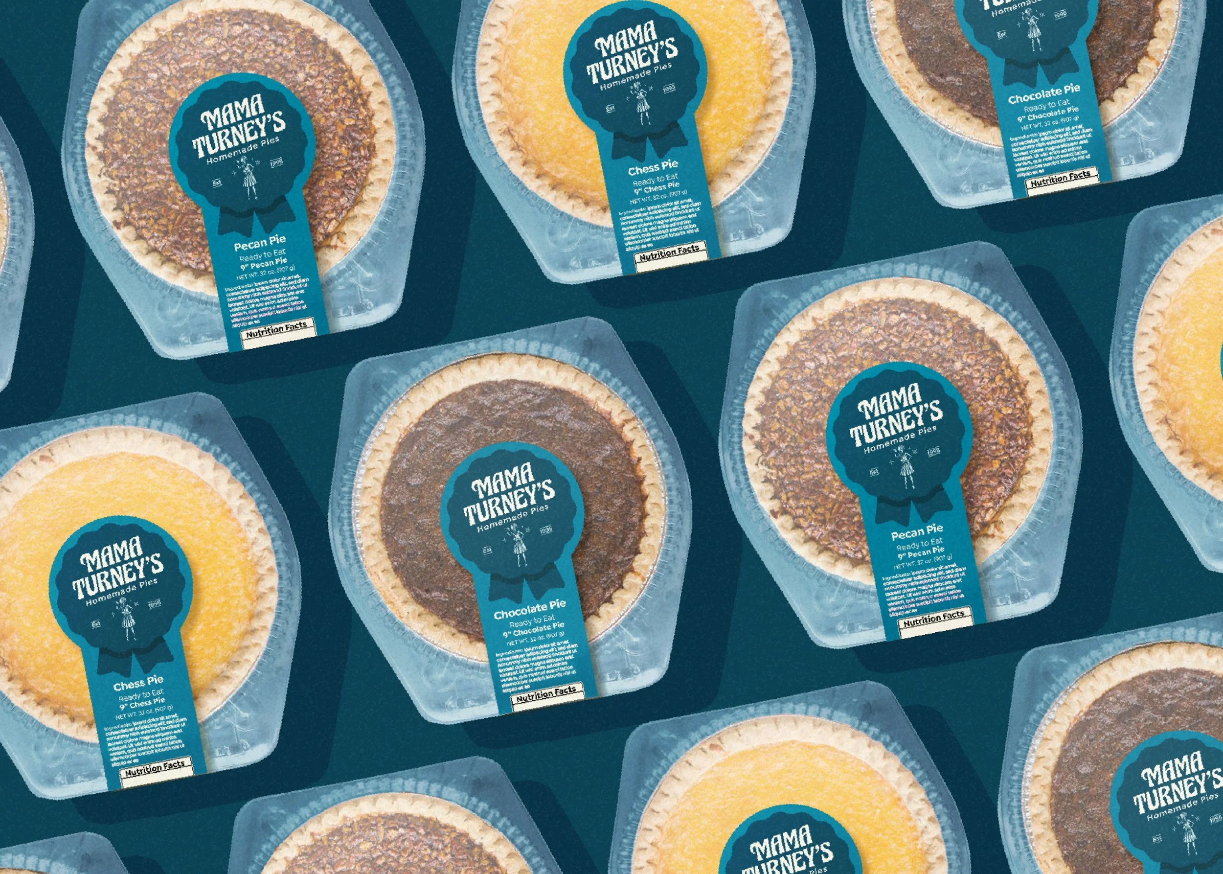
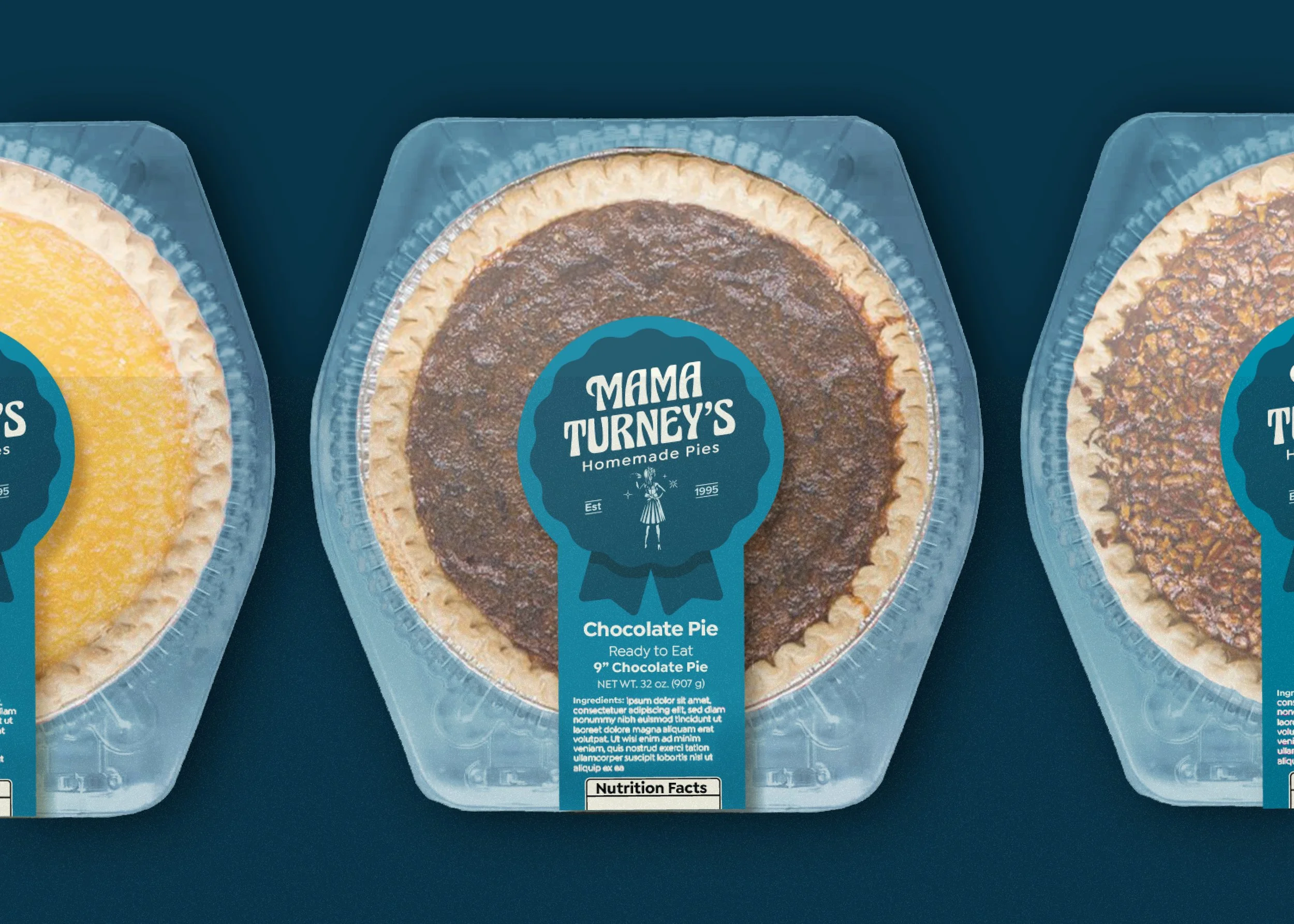
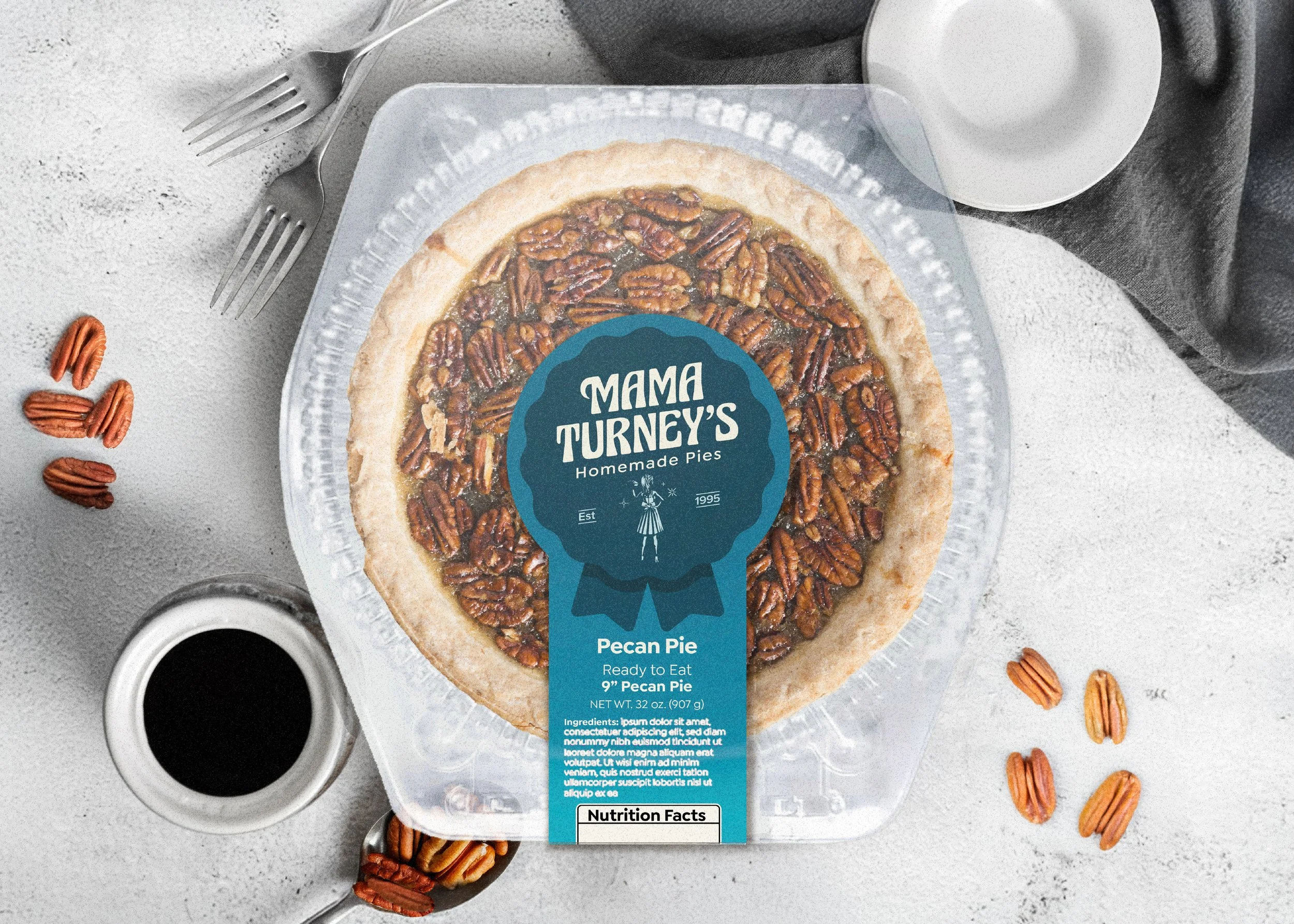
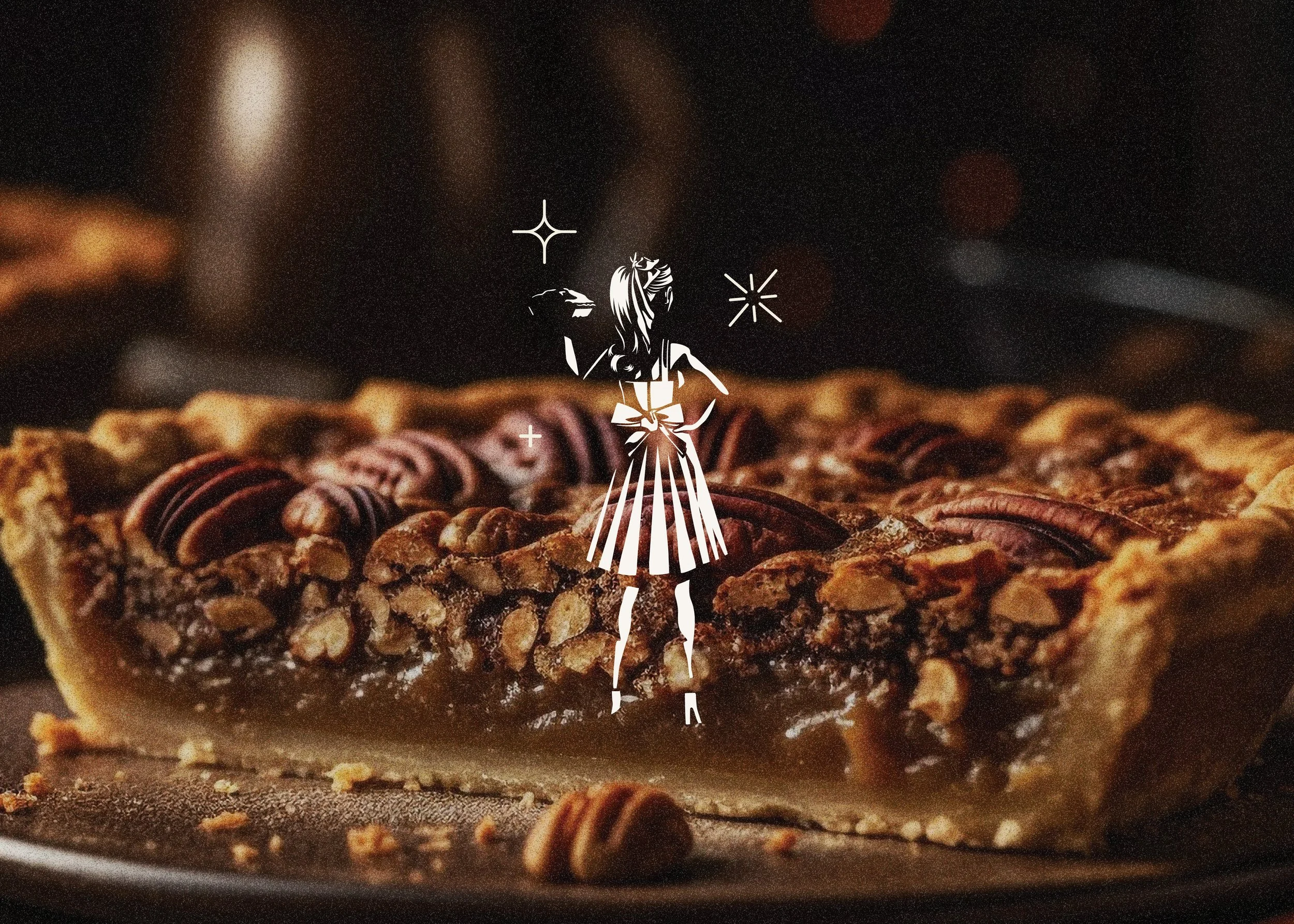
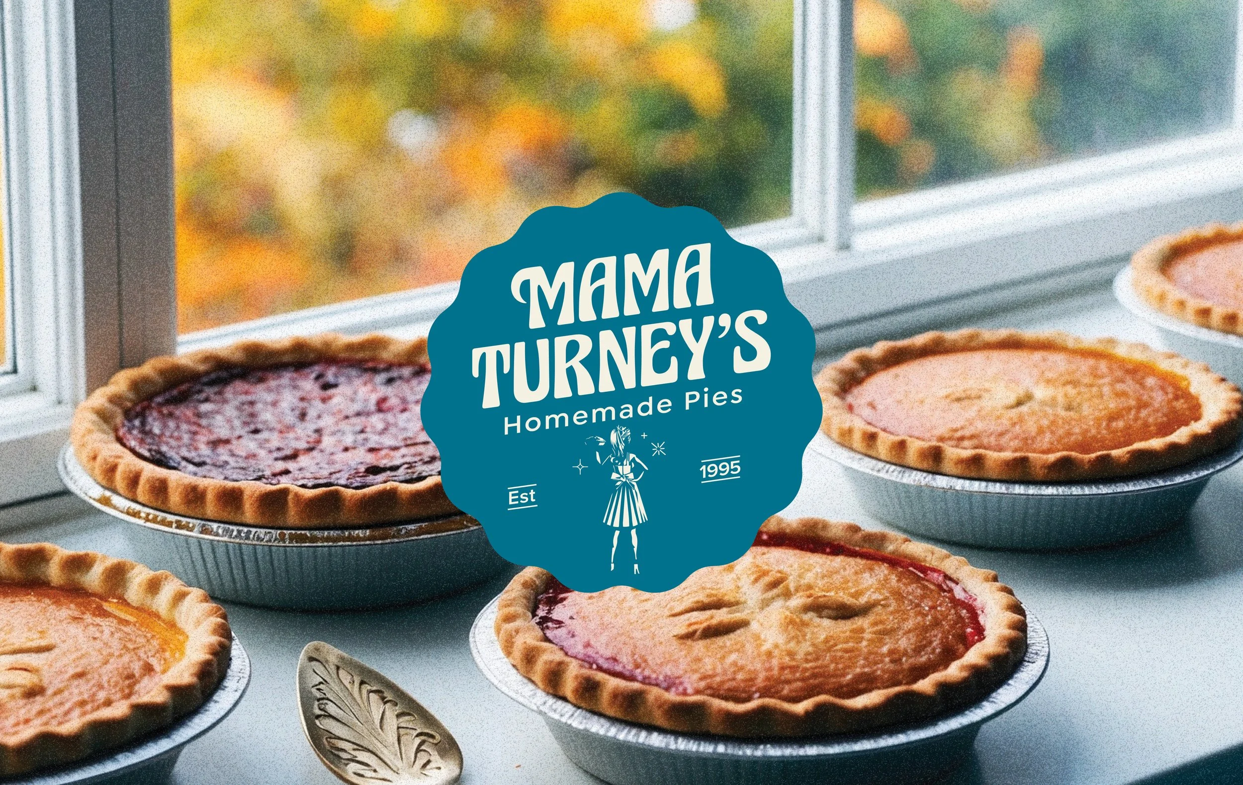
I created a full brand identity and suite of logo marks designed to lean into handcrafted character and heritage cues. The new identity introduced warmth and humanity through thoughtful typography, softer color palettes, and subtle vintage references that feel enduring rather than dated. Every element was intentionally designed to signal care, tradition, and authenticity, reinforcing the idea that this is a brand rooted in real kitchens, not factories. Mama Turney herself became a symbolic anchor within the mark, deliberately left undefined so the brand could remain inclusive, adaptable, and emotionally resonant across generations, allowing customers to see their own traditions reflected rather than being told a single, fixed story.
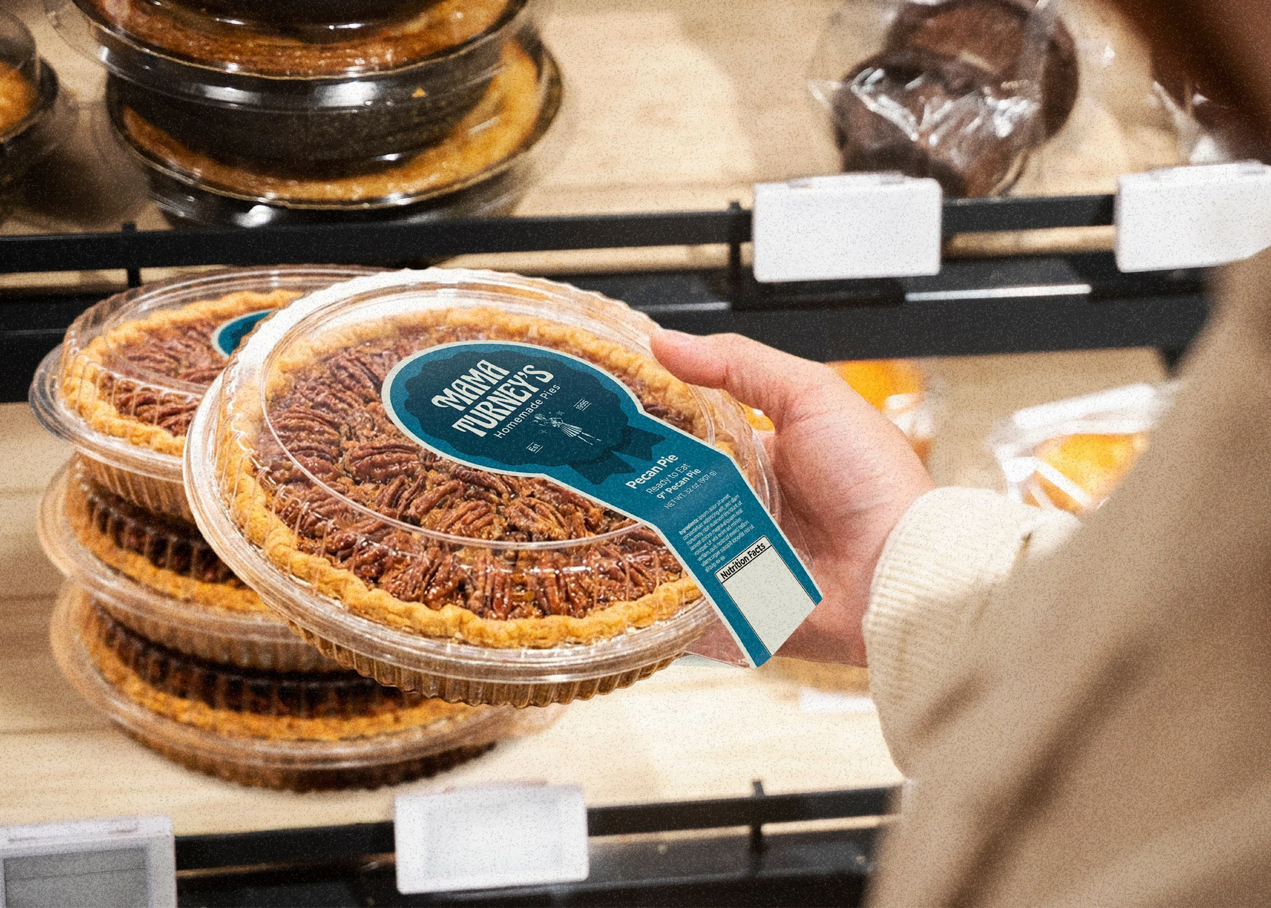
The packaging system was designed to do emotional and functional work simultaneously. It needed to communicate clearly in seconds while also building trust through familiarity. Visual hierarchy, approachable design details, and cohesive storytelling across touchpoints ensured the brand translated seamlessly from grocery shelves to restaurant environments. The result was packaging that feels instantly recognizable, inviting, and aligned with the experience customers already associate with Mama Turney’s.
For food and beverage brands, purchasing decisions are rarely driven by logic alone. Emotional connection plays one of the most powerful roles in how consumers and buyers choose what to bring into their homes or kitchens. Nostalgia, when used thoughtfully, isn’t about looking backward. It’s about anchoring a brand in emotional truth. For Mama Turney’s, this refined identity elevated perceived value, reinforced credibility with restaurant buyers, and created a brand system built to scale without losing its soul.
The final result is a brand that finally matches the product inside the package. Warm, confident, and rooted in legacy, yet ready for its next chapter of growth. This kind of strategic branding doesn’t just make a product look better, it removes friction from the buying decision, builds long-term trust, and gives founders a clear path forward as they expand.
Jenn was wonderful to work with, and provides everything we need for future marketing and advertising needs. We were impressed by her professionalism, responsiveness, and high quality work. The quality and scope of her work cannot be replicated.
— Lauren Simpson
Specialty Foods Company & Mama Turney's

