Lincoln Square Spice Company
Lincoln Square Spice Co. had already built something special long before we ever started working together. The business had existed under a different name for years, backed by deep expertise, a loyal local following, and a product that truly delivered. But as the brand evolved, there was a clear opportunity: carve out the beloved Chicago shop as its own distinct company and build it into something much bigger—something that could live beyond the neighborhood and scale nationally.
We began where we always do—strategy first. Before touching visuals, I worked closely with the executive team to define the foundation of the new brand. This included clarifying their short- and long-term vision for growth, defining their mission and core values, identifying key market problems and how they uniquely solve them, building out detailed audience personas, analyzing competitors and whitespace opportunities, and establishing a clear voice and personality rooted in warmth, knowledge, and approachability. We also mapped out their positioning—how to balance premium quality with a sense of community and human connection that competitors often lack. The goal was to create a brand that felt just as comfortable in a neighborhood shop as it would on a national e-commerce stage.
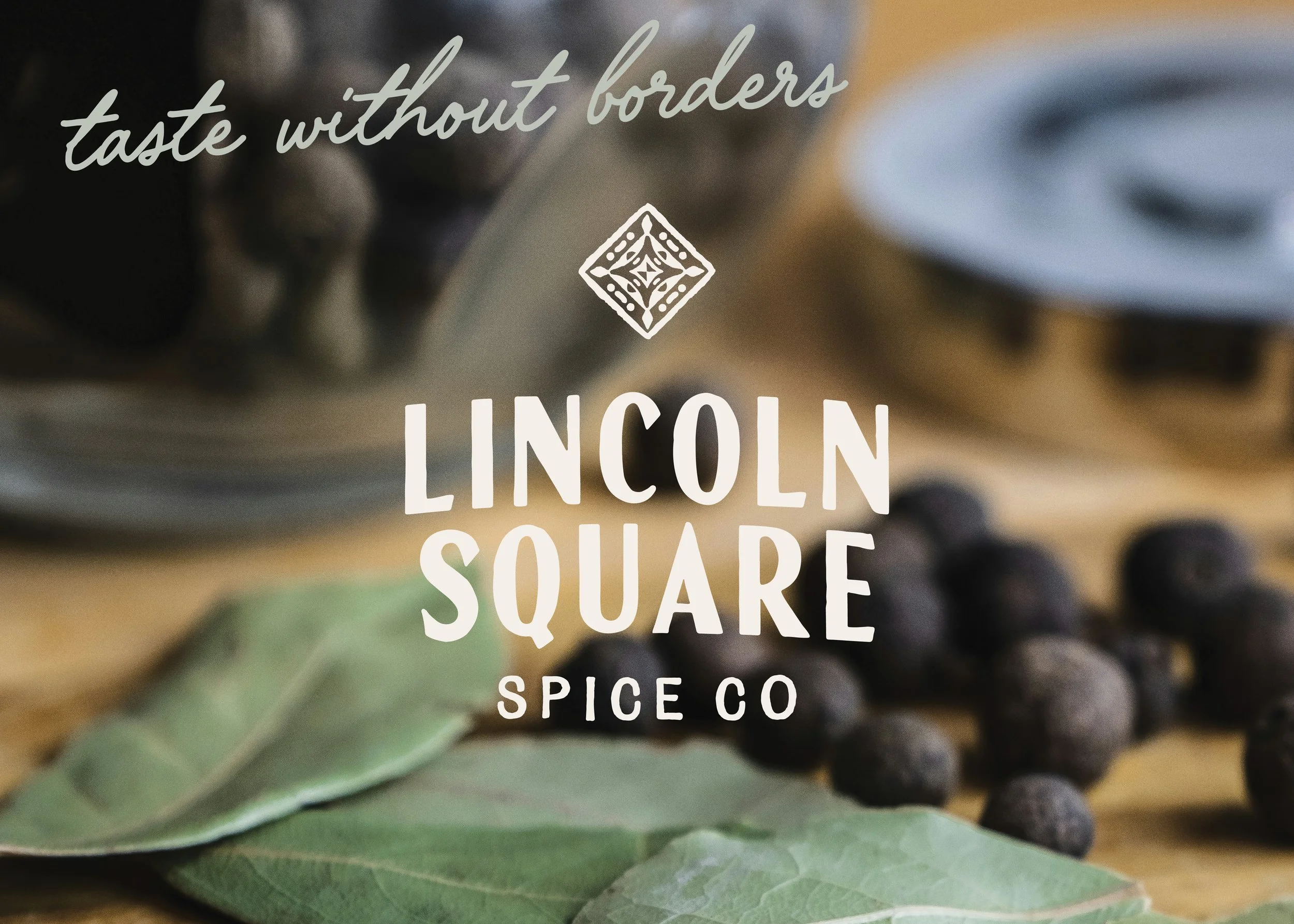
Once that foundation was locked in, I began exploring creative directions. The founders ultimately chose a path that intentionally broke away from category norms. While many competitors leaned into expected vibrant greens and yellows, we built a richer, more grounded palette—copper, antique browns, soft sage, and muted green tones . The result feels earthy, elevated, and quietly confident—premium, but not precious. Distinct, but still approachable for the everyday home cook who wants to experiment without feeling overwhelmed.
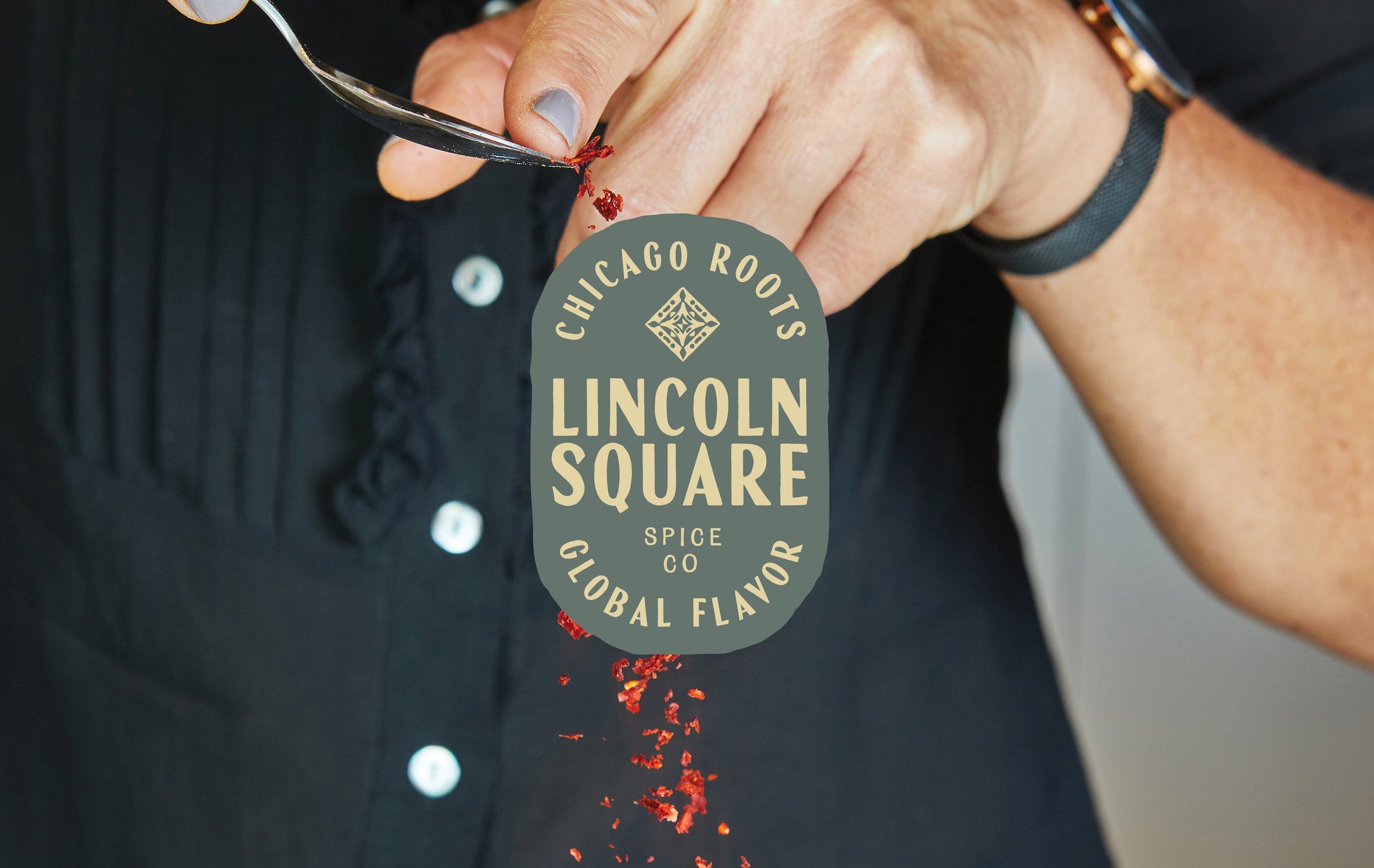
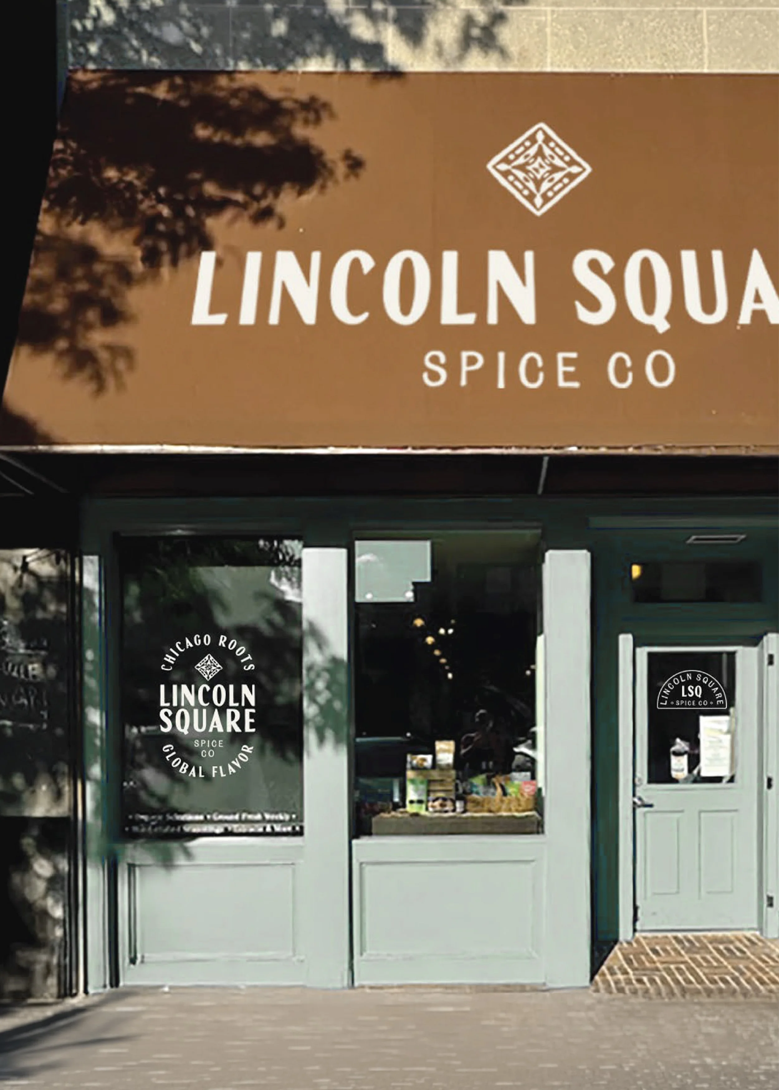
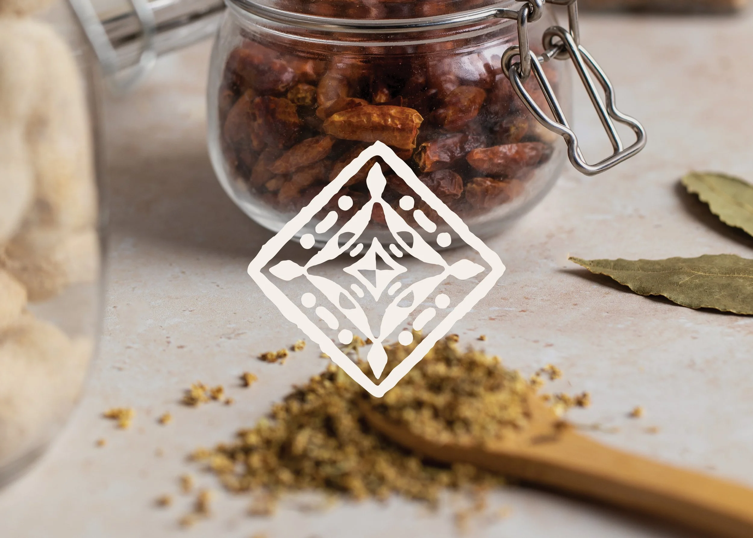
From there, the identity came to life through a deeply intentional system. The logo suite was designed to be flexible and responsive across packaging, digital, and social—ensuring consistency and recognition at every touchpoint . The motif submark draws directly from the stonework found in Lincoln Square’s architecture, giving the brand a sense of permanence and heritage. The recurring arch element, seen in alternate marks, badges, and labels, is inspired by the iconic “Lincoln Square” neighborhood sign—subtly reinforcing place and story throughout the brand . Supporting graphics, patterns, and badges extend this visual language, creating a system that feels layered, ownable, and instantly recognizable.
Typography played a critical role in striking the right balance. We paired clean, highly legible typefaces with more expressive, handcrafted accent fonts—allowing the brand to feel both refined and human . This combination reinforces their positioning as a premium authority in spices while maintaining the warmth and accessibility that invites people in. Across packaging, social, and web, the brand speaks with consistency—approachable, inspiring, and grounded in real expertise.
The final brand feels like it’s always been there. Rooted in Chicago, shaped by culture, and built with the kind of depth and detail that signals trust immediately. It honors the company’s legacy while giving it the structure and presence to scale far beyond it.
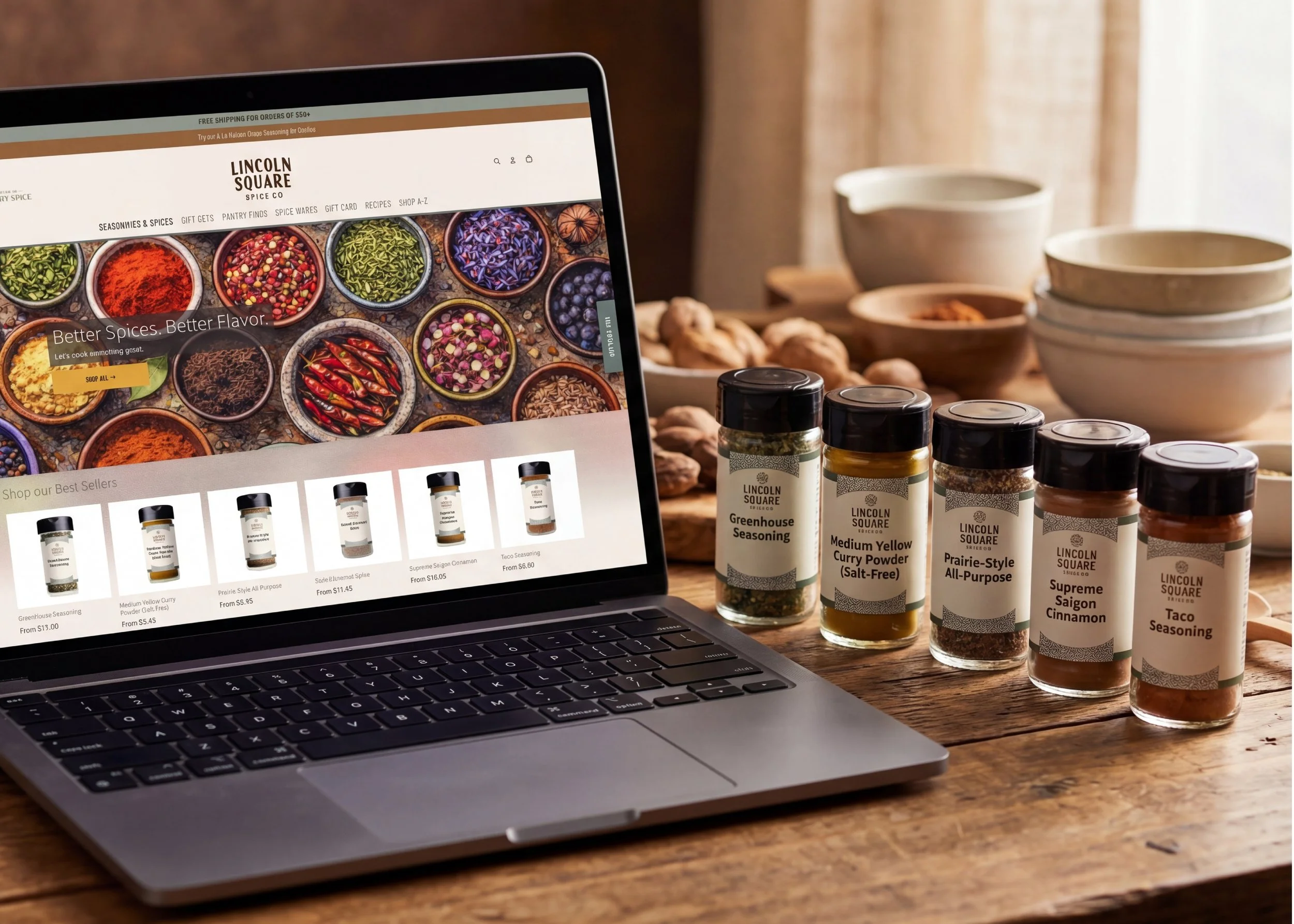
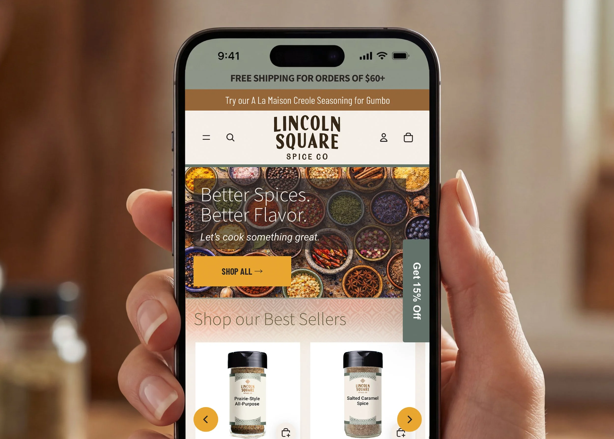
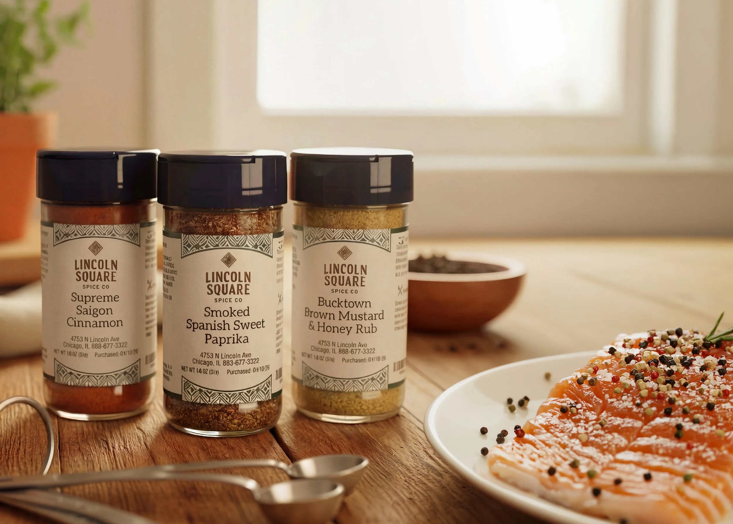
On shelf, the packaging was designed to do exactly what great retail brands do—build trust in seconds. The label system balances clarity with character, using structured hierarchy and refined typography to communicate expertise at a glance, while subtle patterning and architectural details create a sense of depth and craft. Against a sea of loud, color-heavy competitors, LSQ stands out by doing less—but doing it better. The result is a brand that feels considered, credible, and elevated—positioning Lincoln Square Spice Co. not just as another option, but as the premium expert customers instinctively trust.
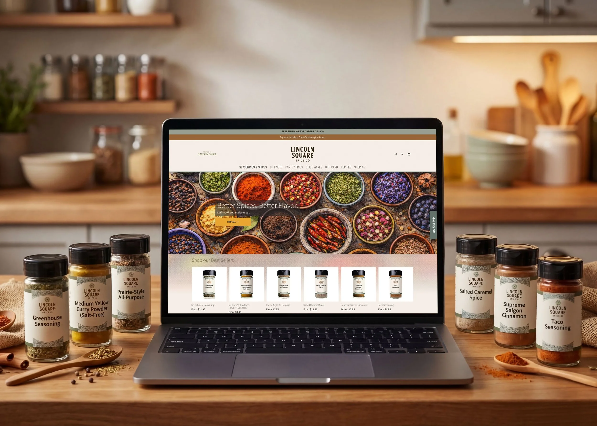
To bring the digital experience to life, I got to partner with the incredibly talented Ry at Rhombus Rose to design and build a Shopify experience that translated the brand into a seamless, high-end e-commerce environment—one that supports both discovery and conversion at a national, and even international, level.
This project is a perfect example of what happens when strategy leads and design follows. We didn’t just create a new look—we built a brand from the ground up that visually communicates the quality they had already earned. One that enters the market not as a newcomer, but as a leader that feels like it’s been trusted for decades, because it has.